Driving user-centered insights
Hana Bank – Mobile UX research
Hana Bank – Mobile UX research
Conducted a pilot test and UI component analysis to refine the transfer flow, delivering clearer insights that improved the fintech redesign and led to a new UX analysis contract.
Company
Hana Bank
Period
2019.02-2019-05
My Role
UX/UI Analysis · User testing & interview · Competitive analysis
Category
Mobile App
Banking
UX Research
Driving user-centered insights
Hana Bank – Mobile UX research
Conducted a pilot test and UI component analysis to refine the transfer flow, delivering clearer insights that improved the fintech redesign and led to a new UX analysis contract.
Company
Hana Bank
Period
2019.02-2019-05
My Role
UX/UI Analysis · User testing & interview · Competitive analysis
Role & Team
UX researcher | 3 UX Leads, 10 UX researchers
Category
Mobile App
Banking
UX Research
1/
1/
Background
Background
Hana Bank aims to enhance mobile UX to improve competitiveness and user experience.
Due to intense mobile banking competition, this B2C fintech project focused on improving Hana Bank’s complex and secure mobile UX, adapting user flows to accommodate diverse age groups across key services like transfers, card applications, and rewards.
2/
2/
Goal
Goal
To optimize the end-to-end money transfer experience, enhancing usability and efficiency.
While the broader team worked on multiple services, I focused on optimizing the end-to-end money transfer experience through UX research.
This included conducting user interviews, analyzing pain points, and validating user needs to inform design decisions. My goal was to enhance usability and efficiency by making the transfer process intuitive and accessible for a diverse user base.
3/
3/
Process
Process
UX Research Process
Research planning
Benchmarking & IA Mapping
User interview & Usability test design
Reporting & design input
UX Research Process
Research planning
Benchmarking & IA Mapping
User interview & Usability test design
Reporting & design input
4/
4/
My Role
My Role
Conducted IA benchmarking, user interviews, usability tests, and synthesized insights.
Team size
13, including 3 UX leads and 10 UX researchers (incl. myself)
My role
IA Benchmarking
Conducted IA benchmarking focused on navigation and form structure.
User Research & Testing Facilitation
Planned and facilitated user interviews and usability testing sessions.
Insight Synthesis & Client Reporting
Organized findings into clear insights and recommendations for the client report.
5/
5/
Challenge
Challenge
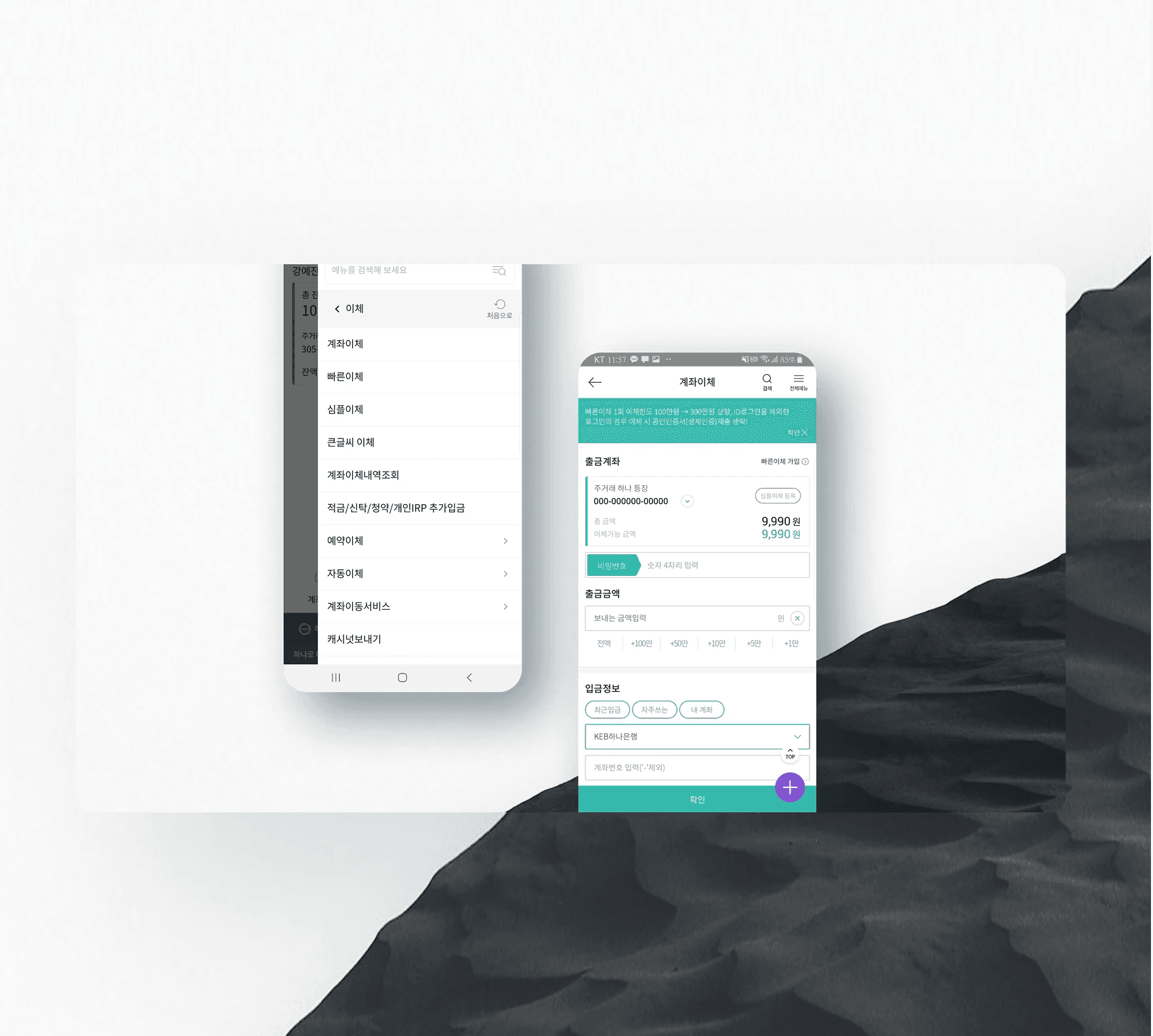
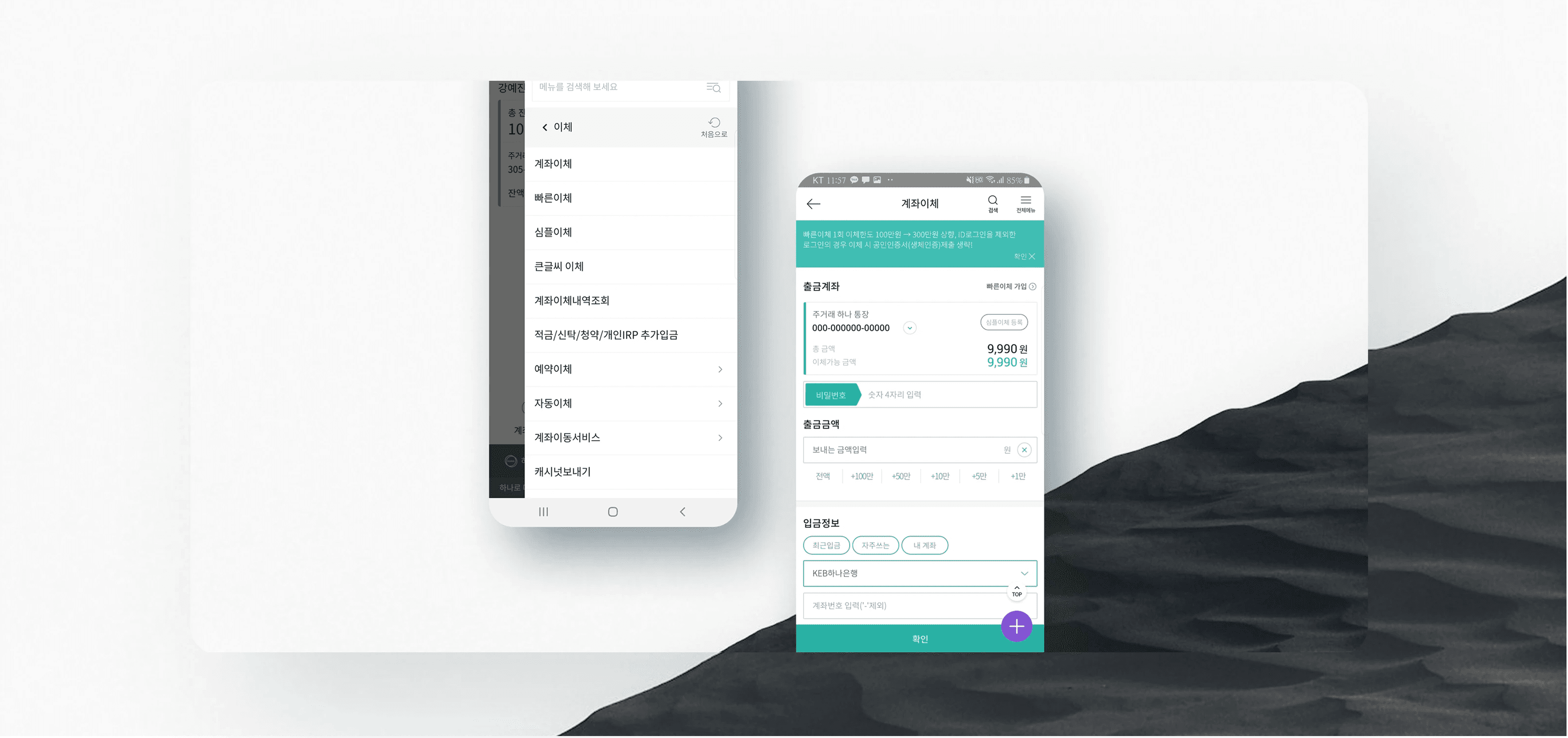
Transfers were the app’s most used feature, but the confusing flow led to frequent errors and drop-offs.
Transfers were the most essential and frequently used feature in our banking app, covering both one-off manual payments and recurring automatic transfers. The challenge was that the flow was fragmented and confusing, leading to frequent user mistakes, incomplete transfers, and a high dropout rate.
6/
6/
Key principle & Process
Key principle & Process
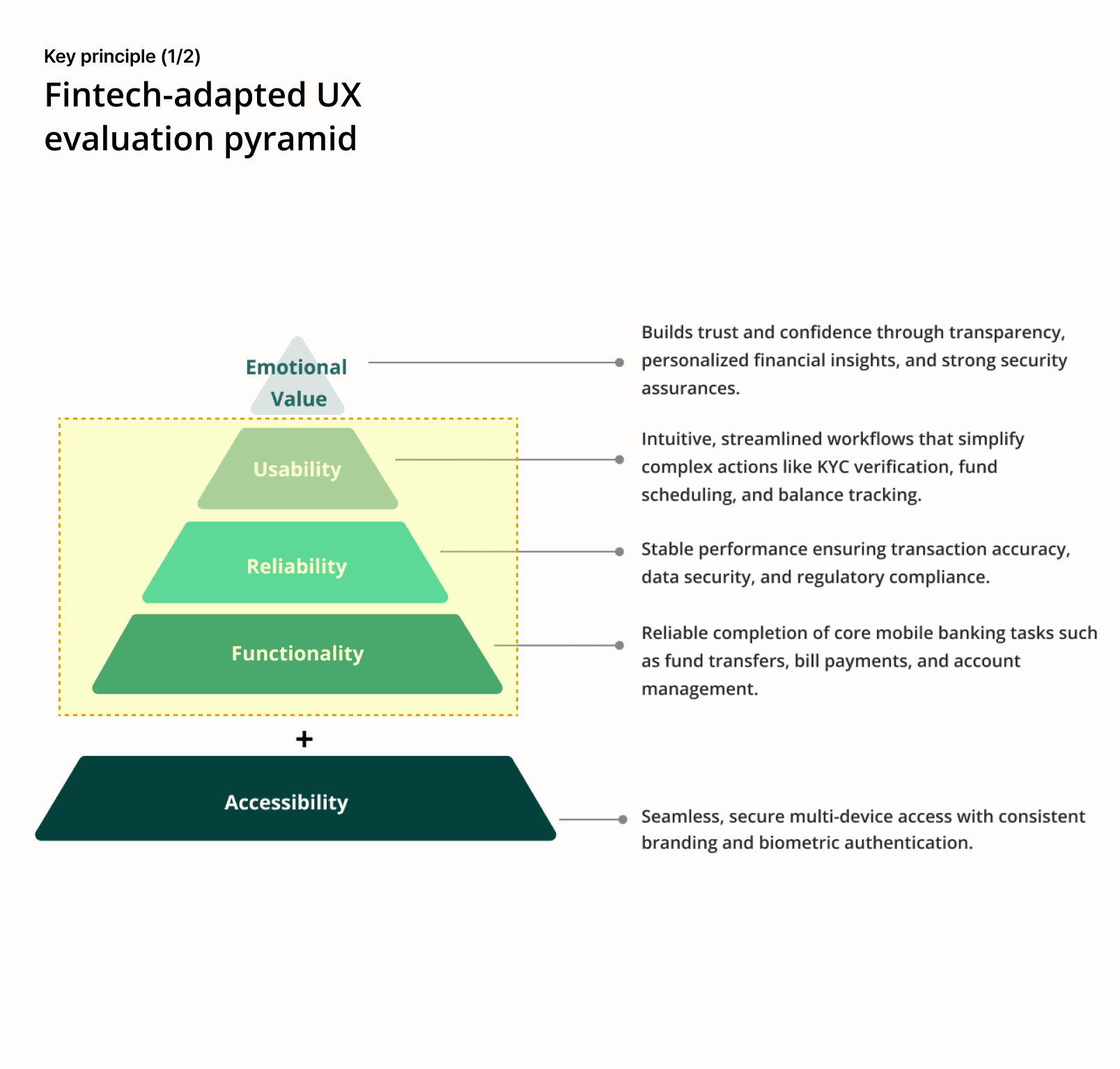
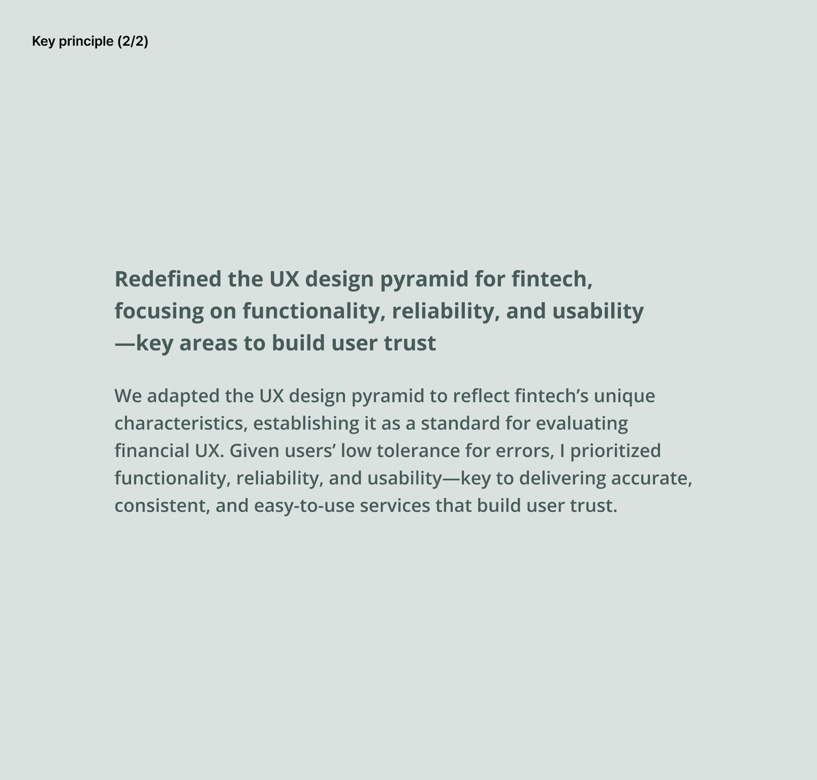
Applied fintech UX principles through benchmarking and user research to guide a functional, reliable, and usable redesign.
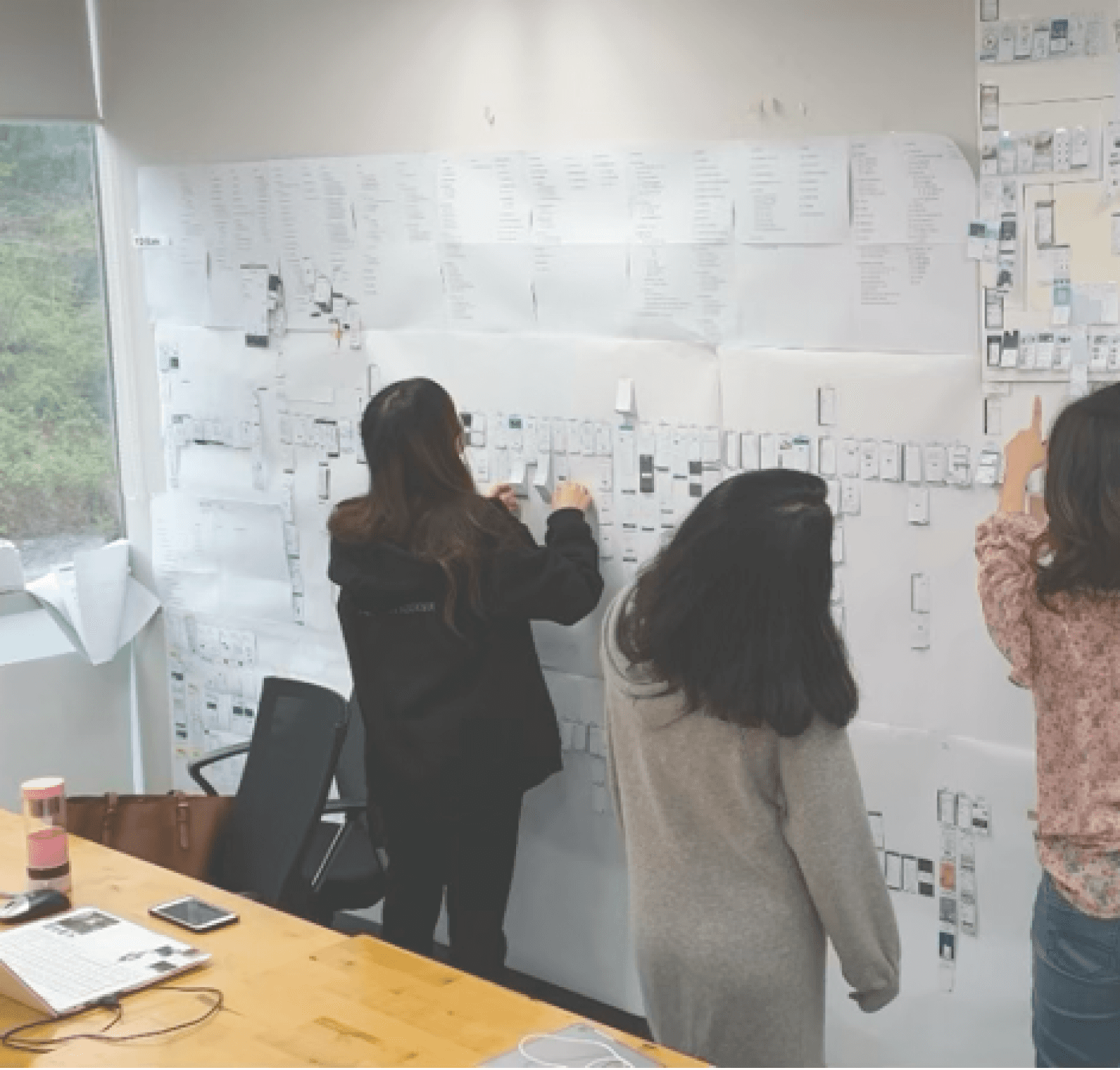
We tailored the UX design pyramid for fintech, focusing on functionality, reliability, and usability to build trust. Using these principles, I analyzed IA, screens, and user behavior to guide the redesign.
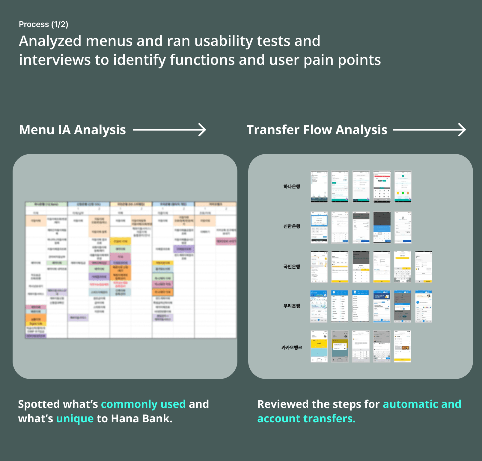
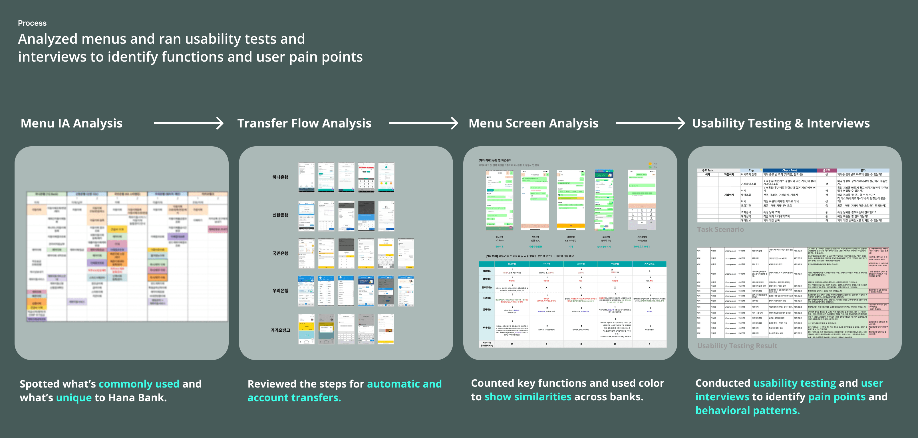
Transfer Menu IA Comparison:
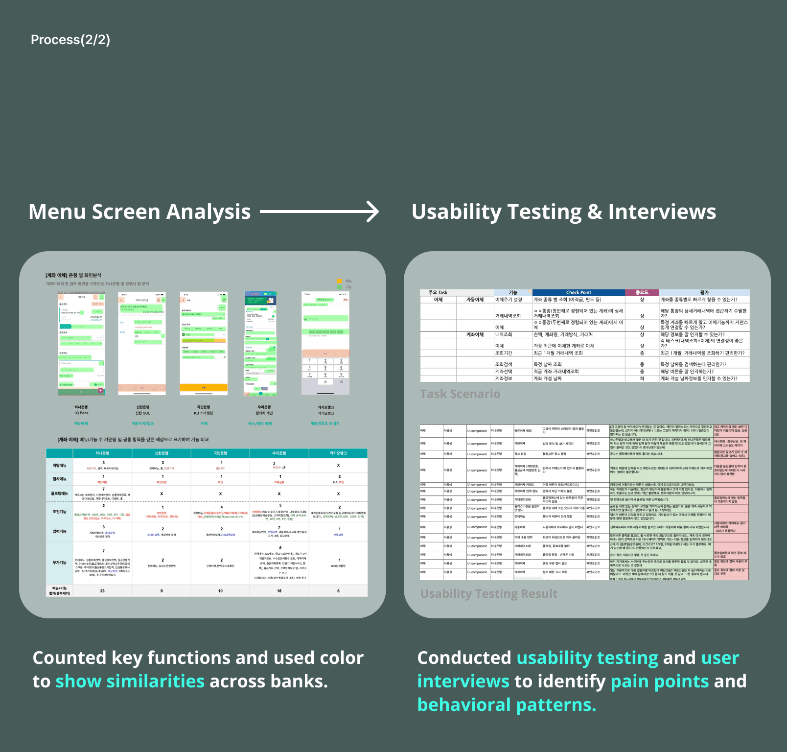
Compared transfer menu structures across banks to identify common patterns and Hana Bank’s unique features.Transfer Task Flow Screen Analysis:
Mapped and visualized key transfer screen features to evaluate usability differences among competitors.Usability Testing & Interviews:
Created task scenarios to observe user behavior in the current flow, uncovering confusion, delays, and inconsistent interactions.User Interviews:
Conducted one-on-one interviews with UX experts and general users to identify pain points and user expectations.
Applied fintech UX principles through benchmarking and user research to guide a functional, reliable, and usable redesign.
We tailored the UX design pyramid for fintech, focusing on functionality, reliability, and usability to build trust. Using these principles, I analyzed IA, screens, and user behavior to guide the redesign.
Transfer Menu IA Comparison:
Compared transfer menu structures across banks to identify common patterns and Hana Bank’s unique features.Transfer Task Flow Screen Analysis:
Mapped and visualized key transfer screen features to evaluate usability differences among competitors.Usability Testing & Interviews:
Created task scenarios to observe user behavior in the current flow, uncovering confusion, delays, and inconsistent interactions.User Interviews:
Conducted one-on-one interviews with UX experts and general users to identify pain points and user expectations.

7/
7/
Solution
Solution
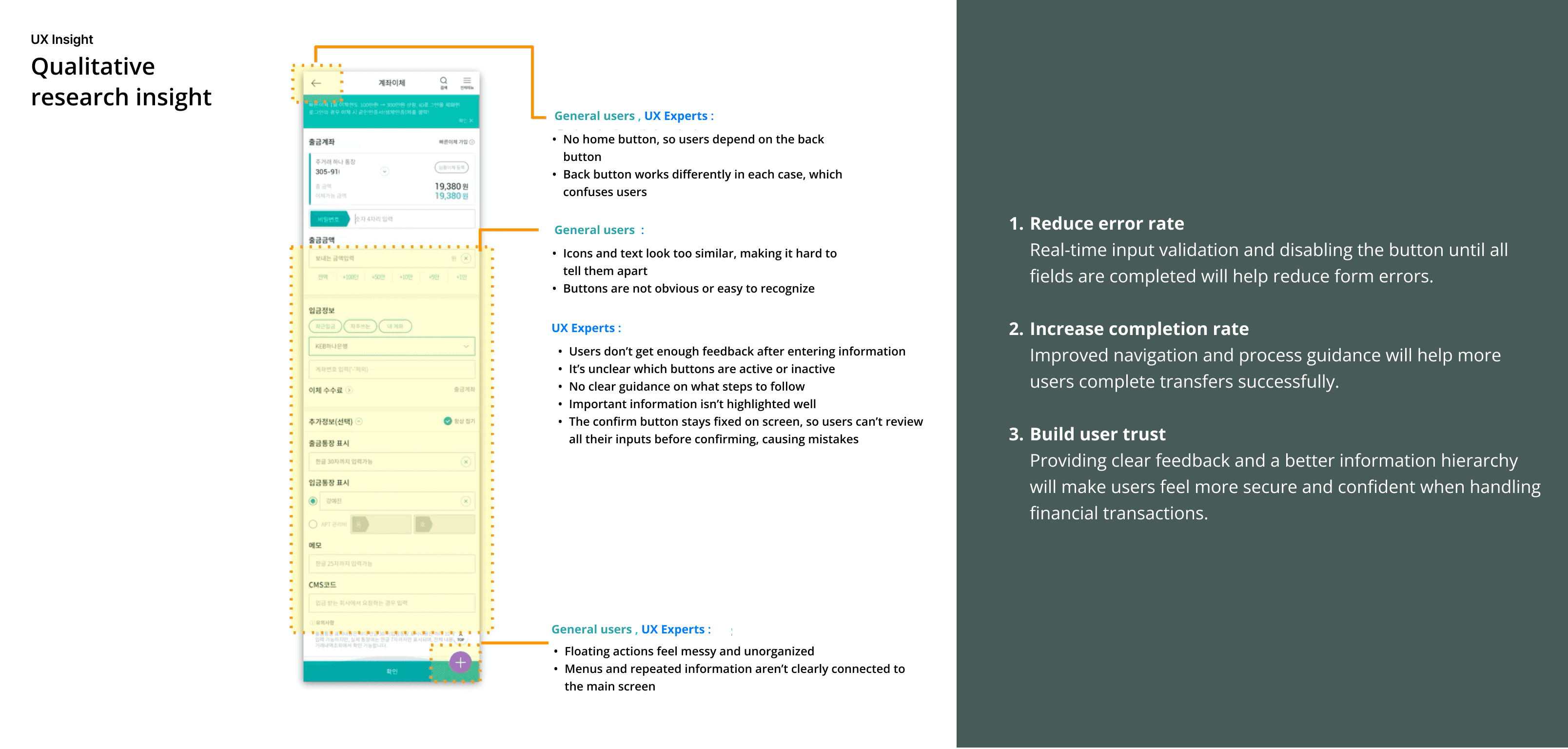
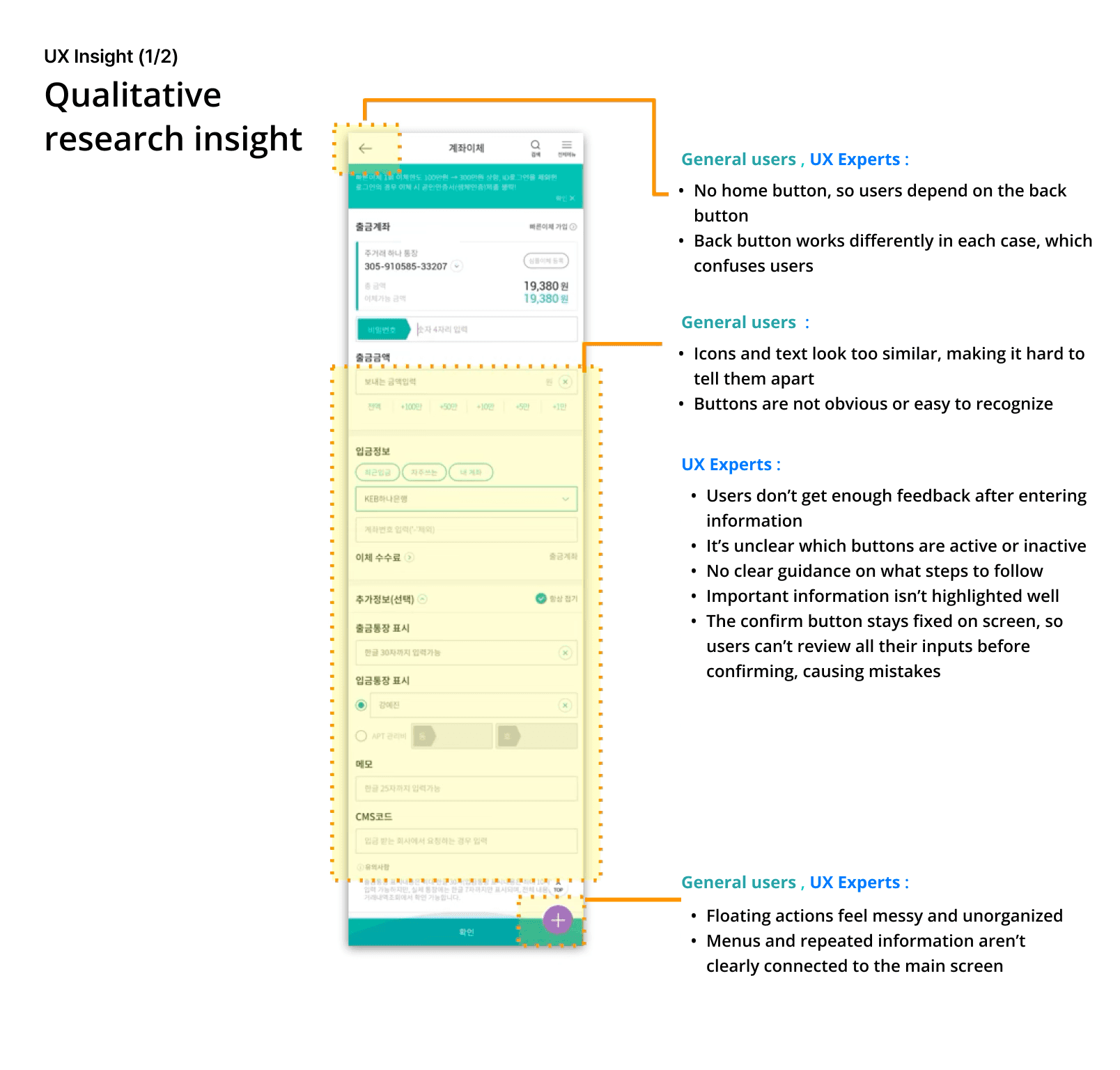
Conducted research and UI analysis to identify pain points and improve error reduction, navigation, and user trust in the transfer flow.
To enhance the transfer experience, I started by conducting qualitative research, including IA and menu analysis, user interviews, and usability testing to uncover user pain points.
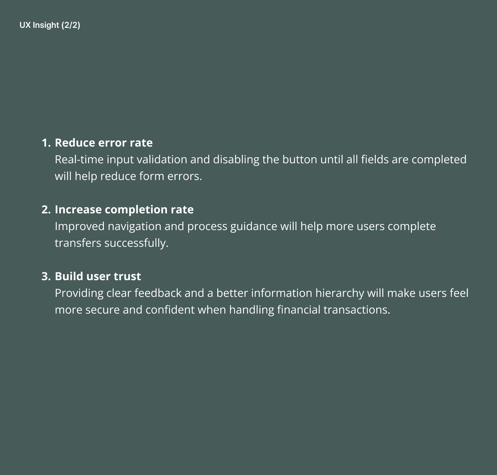
I found that adding real-time input validation and disabling the submit button until all fields were complete would reduce errors. Improving navigation and providing clearer guidance helped increase completion rates and build user trust through better feedback and information hierarchy.
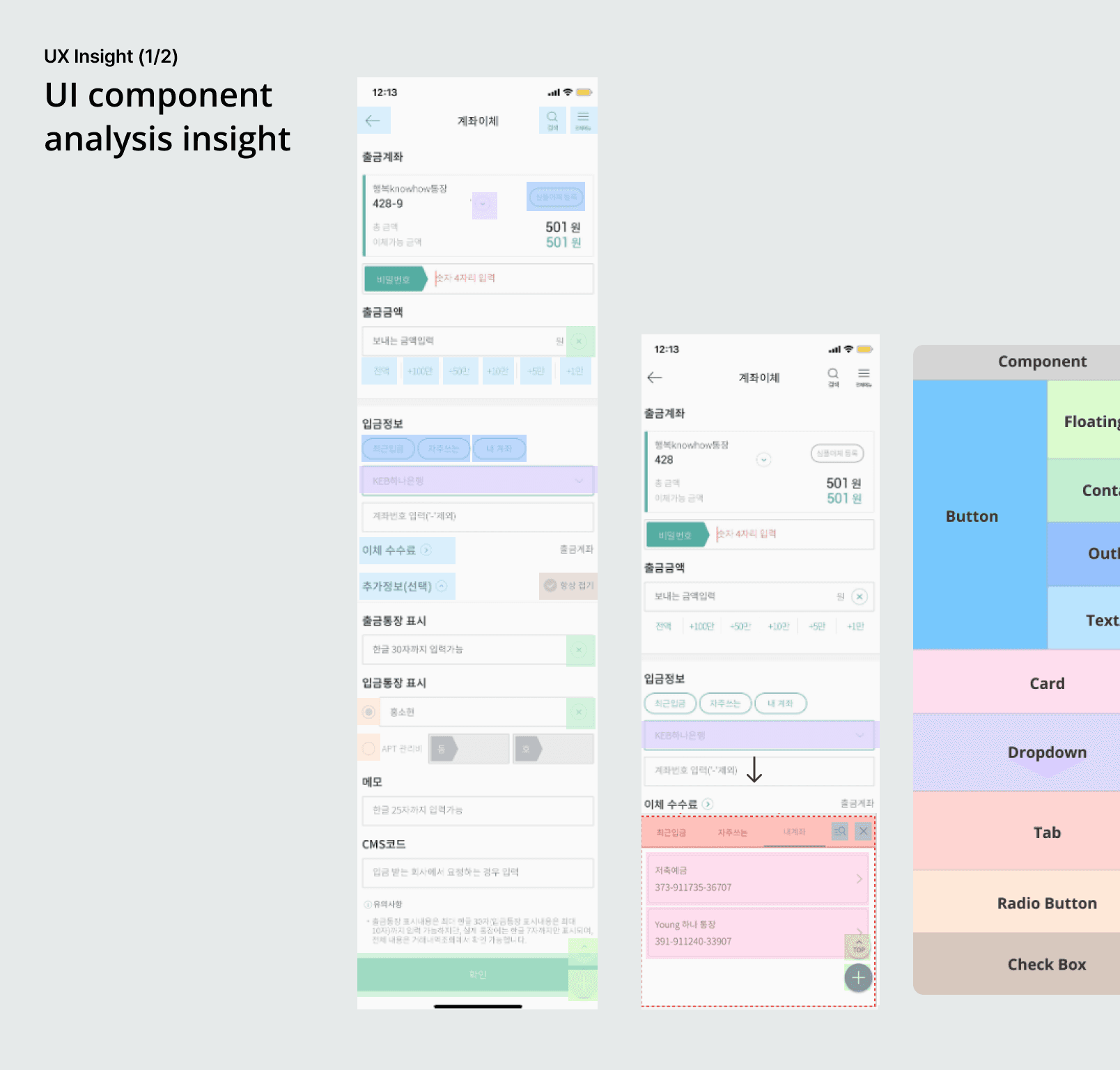
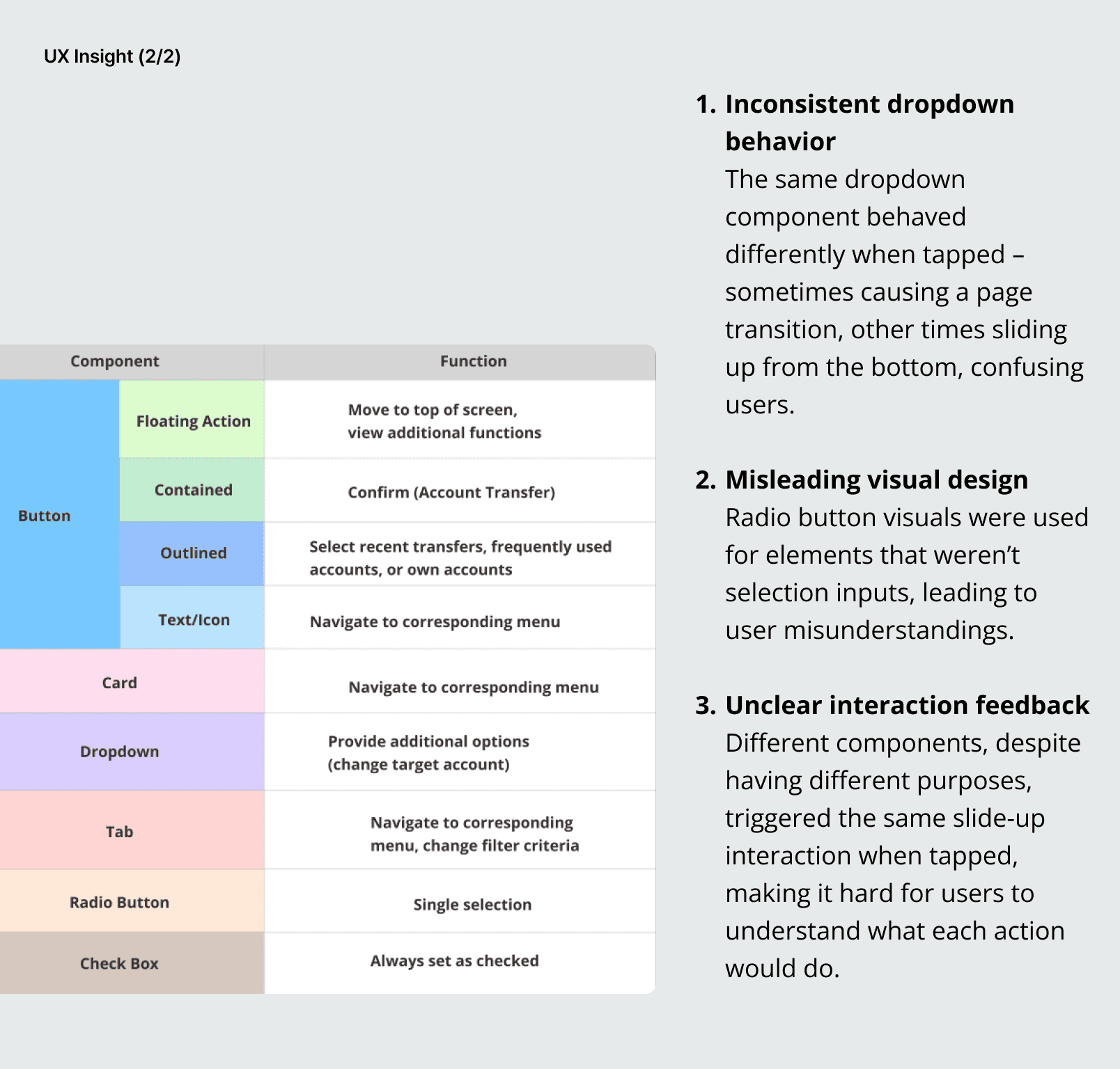
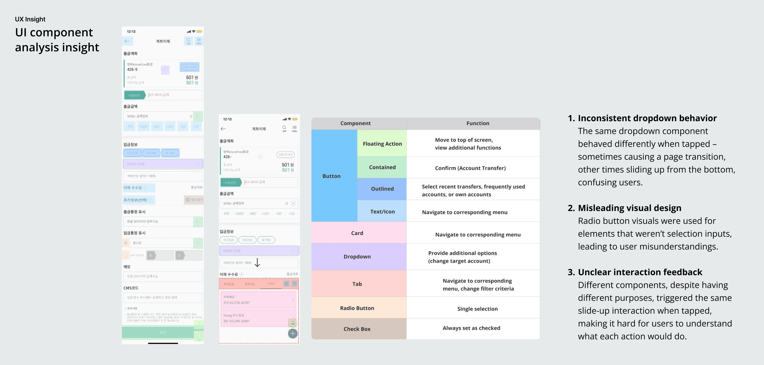
A detailed UI component analysis also revealed issues like inconsistent dropdown behavior, misleading radio button visuals, and unclear interaction feedback that confused users. These findings directly informed design improvements focused on usability and reliability.
Conducted research and UI analysis to identify pain points and improve error reduction, navigation, and user trust in the transfer flow.
To enhance the transfer experience, I started by conducting qualitative research, including IA and menu analysis, user interviews, and usability testing to uncover user pain points.
I found that adding real-time input validation and disabling the submit button until all fields were complete would reduce errors. Improving navigation and providing clearer guidance helped increase completion rates and build user trust through better feedback and information hierarchy.
A detailed UI component analysis also revealed issues like inconsistent dropdown behavior, misleading radio button visuals, and unclear interaction feedback that confused users. These findings directly informed design improvements focused on usability and reliability.
Connect to Content
Add layers or components to swipe between.
8/
Impact & Takeaway
Our client valued our insights, applied them in the redesign, and entrusted us with a new UX analysis contract.
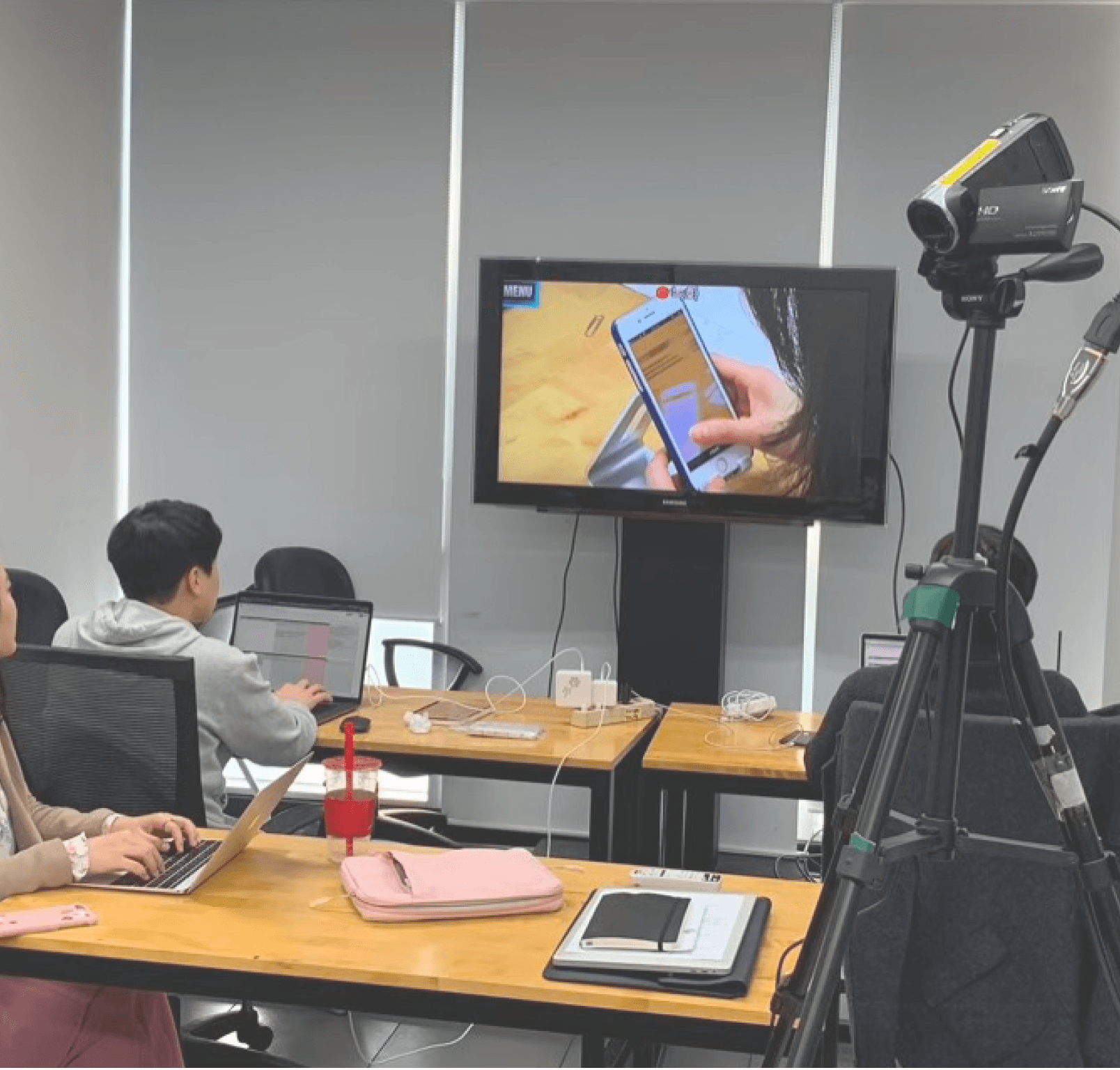
During the project, we faced challenges with unclear questions and impatient testers leading to vague feedback. To address this, I conducted a pilot test to refine our user testing process, which improved the quality and clarity of insights. This experience underscored the importance of human-centered evaluation design in complex fintech services. More importantly, it was the first time I truly felt the joy of UX—transforming complicated financial processes into clear, accessible experiences—and reinforced my passion for creating meaningful user-centered solutions.
8/
Impact & Takeaway
Our client valued our insights, applied them in the redesign, and entrusted us with a new UX analysis contract.
During the project, we faced challenges with unclear questions and impatient testers leading to vague feedback. To address this, I conducted a pilot test to refine our user testing process, which improved the quality and clarity of insights. This experience underscored the importance of human-centered evaluation design in complex fintech services. More importantly, it was the first time I truly felt the joy of UX—transforming complicated financial processes into clear, accessible experiences—and reinforced my passion for creating meaningful user-centered solutions.